An employee can complete a screen quickly and still leave expensive work behind. A request may contain the wrong account, an ambiguous quantity or an attachment that another team cannot interpret. The interface records a successful submission while the organization pays for clarification, correction and repeated handling.
That is why enterprise user experience belongs in a productivity discussion. It shapes how reliably people understand a task, make a decision, complete the work and recover when something goes wrong. Visual polish can help, but the investment case should rest on observable changes in the work itself.
For an operations leader deciding what to improve, the most useful unit is a correctly completed business task. Counting clicks or timing one screen gives only part of the picture.
Begin with a recurring task that matters to the business. Follow it from the user’s initial intent to the point where the receiving person or system can act on the result. Observe what happens between those endpoints, including searching, interpretation, waiting and correction.
Ask users to demonstrate recent real work rather than describe their preferred interface in the abstract. They may have developed compensating routines: keeping a separate list of codes, comparing two windows, copying a colleague’s prior request or sending an explanatory message after every submission. Those routines reveal requirements the application has not made explicit.
Do not assume every workaround is a design failure. Some reflect an unresolved policy, missing source data or a legitimate exception. The investigation should distinguish the cause. A better field label will not resolve two departments using different definitions of an approved supplier.
Trace who bears the effort. A shortcut for the requester may transfer work to the receiver. An apparently efficient application can therefore make the overall process slower while each local dashboard reports improvement.
Consider a hypothetical facilities team receiving requests for replacement equipment. The form asks for an item code, quantity and location. Requesters often recognize the equipment by its everyday name, while the catalog contains similar items sold in different units.
A redesign removes the confirmation view to save time. That might reduce interaction time, but it also removes the place where a requester could notice that the selected item is a carton rather than a single unit. The relevant question is whether the complete request becomes easier to submit correctly.
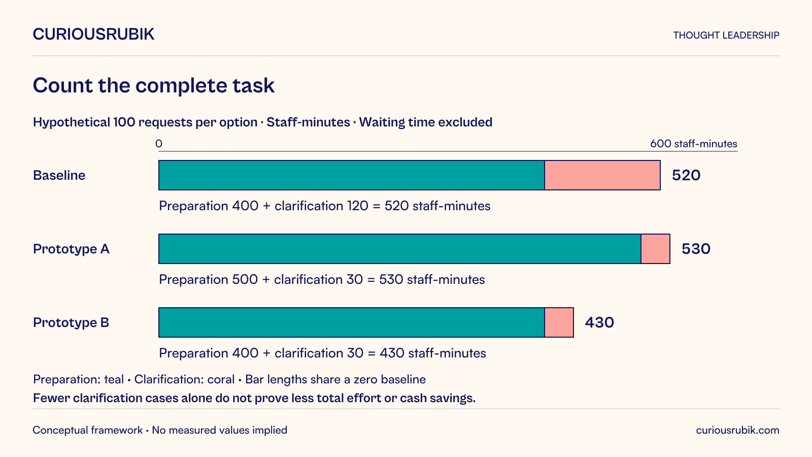
Suppose the hypothetical baseline contains 100 requests, each taking four minutes to prepare, plus 20 clarification cases requiring six additional staff-minutes each. Under these simplified assumptions, the modeled handling effort is 400 plus 120, or 520 staff-minutes.
A hypothetical prototype takes five minutes per request but produces five clarification cases at the same six-minute effort. Its modeled total is 500 plus 30, or 530 staff-minutes. Clarification falls, yet total measured handling effort rises by ten minutes. The result does not support a time-saving claim.
It might still be worthwhile if it prevents consequential ordering errors or improves accessibility, but those benefits need separate evidence. Conversely, a prototype taking four minutes with five clarification cases would model 430 staff-minutes, a reduction of 90 against the stated baseline. These are illustrative calculations, not observed outcomes or guaranteed cash savings.
The example shows why the team should measure both initial interaction and downstream repair. It also makes a design tradeoff visible instead of treating fewer errors or fewer clicks as sufficient on their own.
In the equipment example, the team should investigate what information distinguishes similar items. A useful selection view might show the common name, identifier, unit of issue and a relevant description. An image may help where appearance is meaningful, but it should not be the only way to identify the item.
The design should support recognition without pretending ambiguity has disappeared. If the requester cannot determine the correct item, provide a controlled way to ask for assistance rather than encouraging a guess. The receiving team needs enough context to resolve the uncertainty without starting the conversation again.
Defaults deserve particular attention. A default location can reduce effort when it is usually correct and clearly visible. The same default can create silent errors for employees who work across sites. Test whether people notice and understand it under realistic conditions.
Progressive disclosure can reduce clutter by revealing detail when needed. It becomes harmful if it hides information required for a consequential choice. The criterion is whether the person has the right evidence at the decision point, not whether the screen contains the fewest elements.
Users need to distinguish work that is still being edited, saved as a draft, submitted for review and accepted for action. A generic success message can blur these states and cause unnecessary follow-up or missed action.
Use language that describes the actual result. If a request has been received but requires clarification, say so and identify the next responsible role. If a submission failed, explain whether the information remains saved and what the person can safely do next.
Recovery is part of the task. Preserve valid information when a field needs correction where it is safe to do so. Associate the explanation with the affected field and provide a useful summary for longer forms. A message saying invalid input leaves the user to diagnose the system’s expectations.
An undo or correction path should reflect business consequences. Editing a draft differs from changing an order already acted upon. Good experience makes that distinction intelligible; it does not bypass the controls required after a commitment has been made.
Enterprise applications serve people with different visual, motor, cognitive and other access needs. A task that works only with a mouse, depends on color alone or loses its meaning when enlarged excludes some users from reliable independent work.
The June2018 WCAG2.1 recommendation includes criteria addressing keyboard operation, visible focus, meaningful labels, error identification and reflow. These provide concrete accessibility considerations for interface design and testing. Meeting a few selected criteria does not establish full conformance, and this article does not determine any organization’s legal obligations. W3C, WCAG2.1, June2018 recommendation.
Include people who use relevant assistive technologies in research and testing, with appropriate consent and support. Do not use an automated scan as a substitute for completing the actual task. The interaction between labels, focus order, instructions and status messages matters across the journey.
Accessibility also affects purchasing and implementation decisions. Teams should ask for evidence on the workflows they will use, including configured extensions and embedded components. A platform’s general statement does not prove that the delivered application is usable in its specific form.
A usability session should give the participant a realistic goal and enough context to act, while avoiding instructions that reveal the intended navigation. If the researcher says which button to press, the session is testing compliance with directions rather than whether the interface communicates the task.
Include experienced and less frequent users. Experts may know codes and shortcuts that occasional users cannot reasonably retain. Conversely, a design optimized only for first use may add repetitive effort to high-frequency work. The appropriate balance depends on the audience and task.
Observe completion, errors, requests for help and recovery. Ask what the participant believes happened before explaining the system. A confident but incorrect interpretation can be more consequential than an obvious moment of hesitation.
Use realistic but suitably protected data. Test exceptions such as unavailable items, changed locations and interrupted sessions. These conditions help reveal whether the interface supports the work after the straightforward path ends.
Small qualitative studies can identify concrete problems, but they do not establish population-wide improvement percentages. Quantitative claims require an appropriate measurement design, adequate observations and attention to task mix and other changes.
Define the comparison before implementation. State what counts as a completed task, which roles’ effort is included, how correction work is captured and what quality must be maintained. Keep elapsed waiting time separate from active staff time.
Where possible, compare equivalent task types and user groups. A faster average after launch may reflect simpler requests or experienced staff rather than the redesign. Record training, policy and data changes that occur alongside the interface update.
Do not convert every modeled minute into a financial saving. Released capacity can be useful without reducing payroll or expenditure. Explain how the time could be used, whether work can actually be reassigned and whether a cash effect is expected at all.
Include the cost of the improvement: research, implementation, testing, training, maintenance and any new support obligations. A reusable component can spread benefits across workflows, but each workflow still needs evidence that the pattern fits its task.
A useful decision record pairs the proposed change with the observed problem, expected mechanism, affected users, success measure and possible downside. It prevents attractive redesign ideas from becoming an unprioritized wish list.
Not every inconvenience deserves an immediate redesign. Prioritize using evidence about frequency, effort, error consequences and who is excluded or dependent on assistance. A rare but serious misunderstanding can matter more than a frequent harmless extra click.
Sometimes the best first intervention is a clear label, a better comparison view or a reliable correction path. Sometimes research exposes a deeper problem in policy or data that the interface alone cannot solve. Make that dependency visible rather than disguising it with a new screen.
Enterprise user experience improves productivity when it helps people complete the right work correctly, with a clear understanding of its state and consequences. The business case becomes stronger when it measures that whole result and remains honest about the tradeoffs required to achieve it.