
Last reviewed: 10 October 2026. Product details reflect this review date. Availability and behavior can vary by account, role and release.
Editorial ink illustration: Two colleagues compare charts and discuss the definitions behind them.
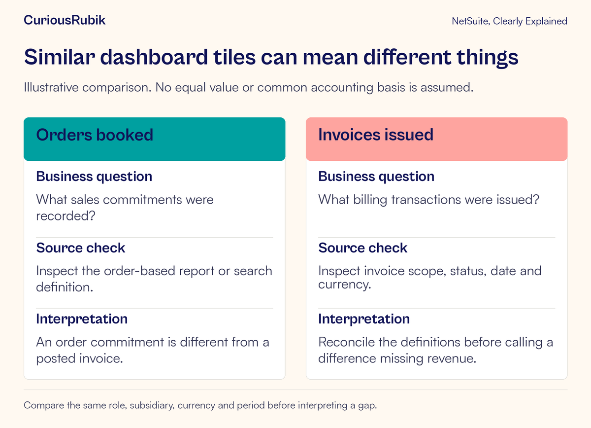
A manager sees 20,000 in orders and 12,000 in invoices and asks where 8,000 of revenue went. The question sounds reasonable, but it combines two different business events. Orders record commitments. Invoices record billing. A difference between them needs reconciliation before it becomes an accounting conclusion.
NetSuite dashboard KPIs provide a compact way to monitor measures. Standard KPIs draw on report data, while custom KPIs can use saved searches. The compact display is useful precisely because the detail is elsewhere. A reliable reader knows how to get back to that detail.
This lesson explains how to identify a KPI’s definition, compare it fairly, and investigate a gap. It also covers the specific saved-search requirements for custom KPIs that compare multiple date ranges.
Write the definition before interpreting the trend
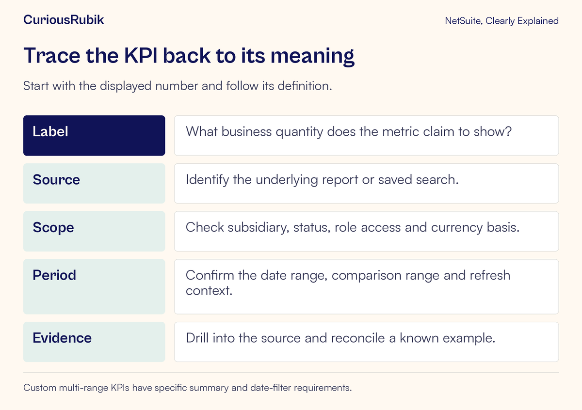
Start with five questions. What quantity does the label describe? Which report or search supplies it? Which records are included? Which period is being measured? What unit or currency is used?
“Sales” is often too broad to answer those questions. A team may use the word for order intake, invoiced value, recognized revenue, or cash collected. Those measures can all be useful, but they should have distinct definitions. A short label cannot substitute for the underlying definition.
Create a simple metric note in your team’s reporting guidance. For example: “Orders entered in the selected transaction-date period, within the agreed status and subsidiary scope, expressed on the defined currency basis.” This is a suggested description, not the name or definition of a universal built-in KPI.
Add the business decision the metric supports. An order-intake measure may help assess future workload. A billing measure may help investigate invoicing throughput. Clear purpose prevents one number from being used to answer every finance and operations question.
Drill into the source before changing the dashboard
KPI portlets support drill-down to their underlying data. Standard measures lead to report detail; a custom KPI can lead to the results of its source saved search. Use that route to examine the records behind an unexpected value.
Check the actual source rather than reconstructing it from memory. A custom search may have a status condition, subsidiary restriction, formula, or date choice that is easy to overlook from the dashboard. Available KPIs and accessible data also depend on the role and enabled features.
Choose one known customer or transaction for a small reconciliation. Can you find it in the source? Does it belong in this period? Does the measure use the value you expected? If a record is missing, identify the condition that excludes it before proposing a correction.
The transaction search lesson explains why one invoice can produce several result rows. That distinction matters whenever a custom KPI counts or sums search results. A neatly displayed KPI can still inherit a repeated amount from an incorrectly scoped search.
Reconcile the fictional 8,000 difference
Consider a teaching example in one currency. The team defines an order measure and an invoice measure for the same month. For simplicity, the example excludes taxes, credits, discounts, currency conversion, and cancellations.
The selected month’s orders total 20,000 currency units. Of that amount, 11,000 has been invoiced in the month and 9,000 has not. The month’s invoices also include 1,000 from orders placed in an earlier month.
The comparison is therefore:
- Current-month orders: 20,000
- Less current-month orders not yet invoiced: 9,000
- Plus invoices relating to earlier orders: 1,000
- Current-month invoices: 12,000
The arithmetic is 20,000 minus 9,000 plus 1,000, giving 12,000. The displayed difference of 8,000 has an understandable composition. It does not, by itself, establish missing revenue or an error.
The team still needs to investigate whether the 9,000 awaiting billing is expected. Some of it may be scheduled for later work; some may represent a billing delay. That is a process question for the relevant orders and billing rules. The KPI comparison identifies where to look, while the records explain what needs action.
This is an invented reconciliation, not a representation of a default NetSuite report or a revenue-recognition rule. Actual transactions require their own scope and accounting review.
Make comparisons genuinely comparable
Two values should be compared in the same role, subsidiary, currency, and period context unless the comparison intentionally studies those differences. Also check whether both sources use the same date concept and status population.
A month-to-date value compared with an entire prior month can look weak simply because the current month is incomplete. A value based on transaction dates can differ from one based on creation dates. A restricted role can see a smaller population than a broader finance role. Each of these can explain a difference without any record being wrong.
Inspect refresh behavior too. Do not assume every dashboard component and source was refreshed at the same instant. Note when the values were observed, refresh them using the supported process, and compare again in a controlled context.
For a percentage change, examine the underlying amounts and the comparison base. A small base can produce a large percentage movement. A zero base requires special care in interpretation. The business question is usually whether the change is meaningful, not whether a dramatic percentage can be displayed.
Build multi-date-range custom KPIs with their specific requirements
A custom KPI that displays results across multiple date ranges has particular saved-search requirements. Its source search must have no date fields defined as filters on the Criteria subtab. It must have exactly one field with a summary type on the Results subtab; other result fields should have no summary type. It also needs a date field defined as an available filter on the Available Filters subtab.
These requirements apply to the documented multi-date-range KPI use. They are not an instruction to remove date criteria from every saved search. A search used by an operational team may have a deliberate fixed-period definition. Changing it in place can affect other readers and uses.
Ask the search owner to review whether a dedicated KPI source is appropriate. Confirm the intended summary measure, date field, and comparison behavior. Then reconcile each displayed period against a known sample. A search that runs successfully is not automatically suitable for a multi-range KPI.
Keep unrelated configuration changes out of the initial test. First prove that the measure and periods behave correctly. Add dashboard presentation choices after the source definition is stable.
Give discrepancies an owner
Different symptoms belong with different people. A record-level amount question may belong with finance. An order awaiting fulfillment may belong with operations. A repeated search total belongs with the report owner. Missing visibility belongs with an administrator or access owner.
Send a bounded discrepancy report. Include the KPI label, underlying source, active role, observed period, expected value, observed value, and one record that demonstrates the issue. Explain whether you are questioning the source data, the metric definition, or the dashboard display.
Avoid silently modifying a shared search to make two KPIs match. Their difference may be meaningful. If the definition genuinely needs to change, agree the new meaning with the metric owner and tell affected readers when their comparison history changes.
The roles and permissions access review guide helps resolve audience differences. If a dashboard is slow rather than numerically wrong, use the performance investigation workflow to collect reproducible evidence before changing the analysis.
Review one important KPI with your team
Choose a KPI used in a real recurring decision. Ask two readers to explain its meaning independently. If one says “orders” and the other says “revenue,” begin with the definition rather than with dashboard customization.
Trace the source together. Select one included record and one excluded record. Explain why each belongs where it does. For a comparison KPI, repeat the check for both periods. Record any unresolved issue as a specific question with an owner.
Before accepting the metric for routine use, confirm:
- Its label matches the business measure.
- Its source report or search is identified.
- Row meaning and aggregation are understood.
- Scope, currency, date basis, and comparison periods are stated.
- Refresh context and role visibility have been checked.
- A small sample reconciles to the displayed result.
- A named owner can approve definition changes.
CuriousRubik’s NetSuite optimization services can help connect reporting definitions to the decisions and handoffs they support. For the operational meaning behind the worked example, continue with sales orders, fulfillment and billing.
A useful KPI should shorten the path to a good question. The source evidence is what turns that question into a sound decision.