A real-time dashboard improves a decision only when its signal reaches someone who can interpret it, choose an appropriate action, and observe the result within a useful time window. Faster refresh cannot supply missing authority, reveal an unknown cause, or make an infeasible intervention work.
For an operations leader overseeing service queues, the design decision is how a live signal becomes a proportionate response. That requires more than a red threshold. The organization needs to define who investigates, what evidence they inspect, which actions are allowed, and when to stop or reverse an intervention.
A useful dashboard therefore belongs inside a response process. Its purpose may be to direct attention, support diagnosis, or confirm recovery. Those functions should be explicit because the same metric rarely performs all three equally well.
Distinguish the symptom from its explanation
A rising queue indicates that unresolved work is accumulating under the measure’s definition. It does not establish whether the cause is more arrivals, slower handling, a system outage, a changed classification, or delayed data capture. Each possibility can require a different response.
Design the first view to answer what is happening and which population is affected. Provide a route to the evidence needed for diagnosis: arrival and completion rates, age distribution, blocking reasons, relevant system status, and recent process changes where available.
Do not present a generated or manually written causal explanation as established fact unless the evidence supports it. A plausible narrative can make a live display feel more actionable while directing the team toward the wrong intervention.
Google’s SRE monitoring guidance distinguishes symptoms from causes and emphasizes actionable, low-noise alerting. Its examples concern technical services; applying the discipline to a business queue is an operating-design extension. Google SRE, Monitoring Distributed Systems
A hypothetical comparison that cannot choose the action
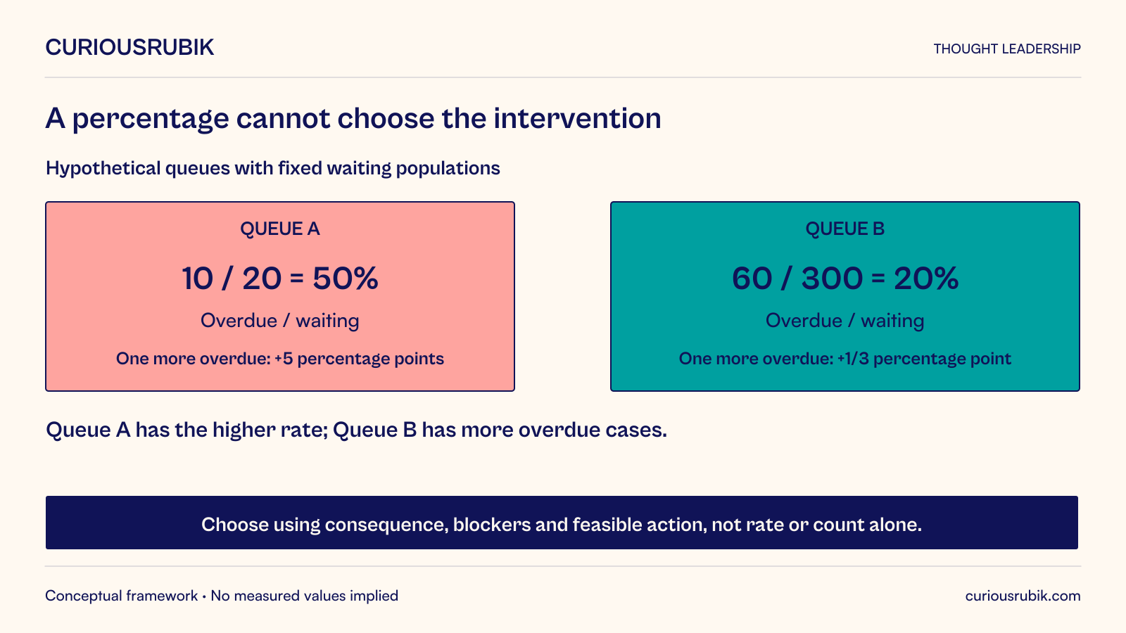
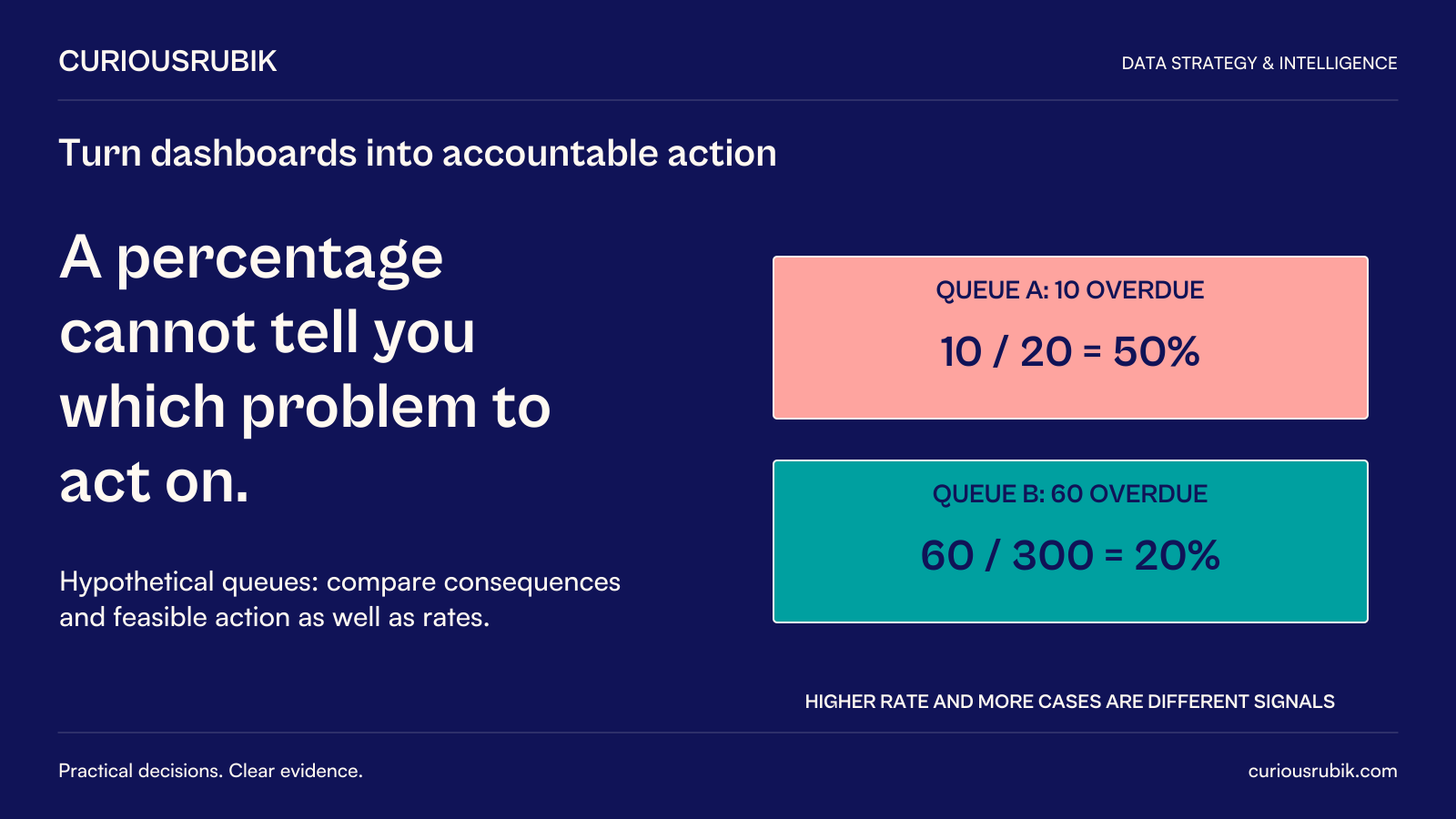
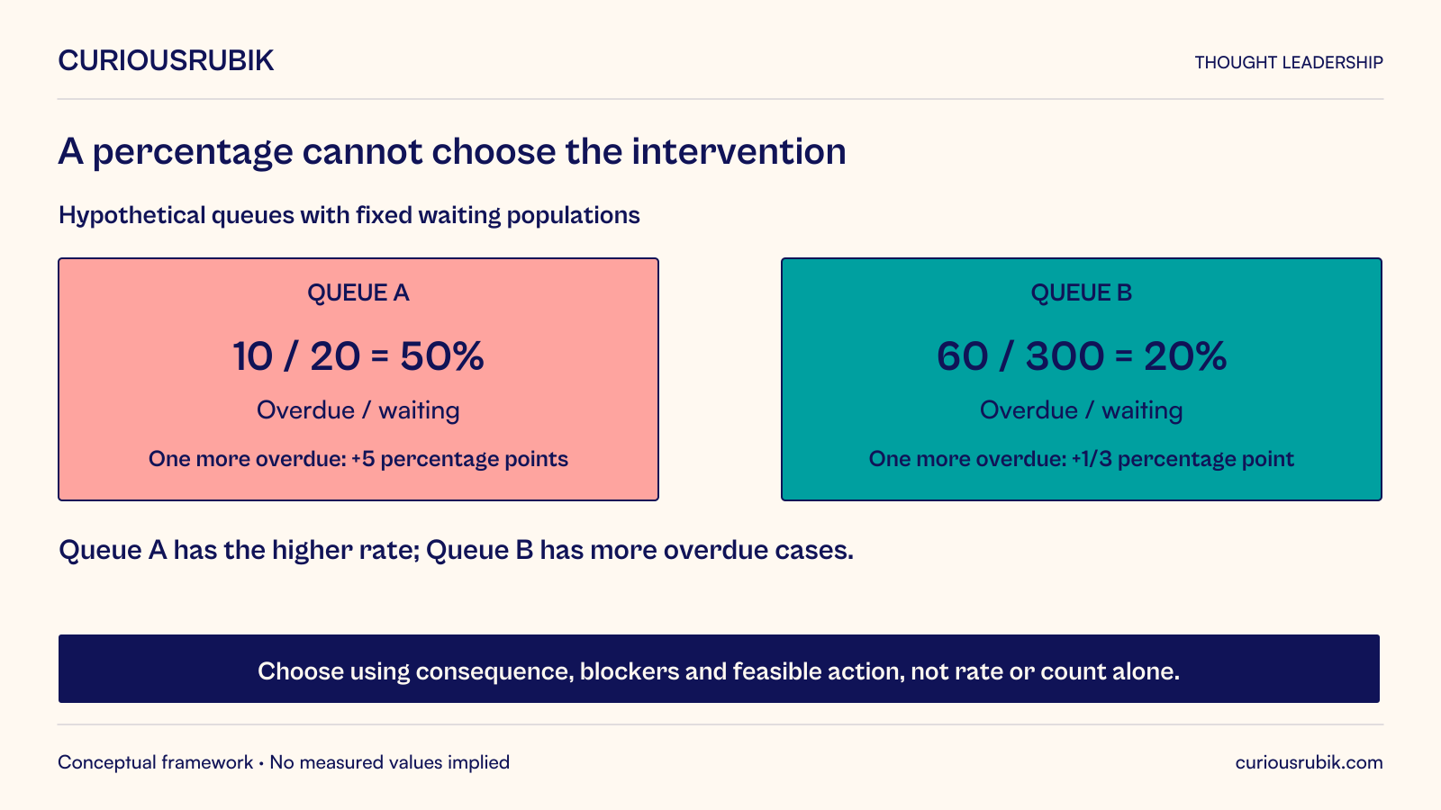
Suppose a hypothetical service dashboard shows Queue A with twenty waiting cases, ten of which are overdue. Queue B has three hundred waiting cases, sixty overdue. A has a 50 percent overdue share; B has a 20 percent share.
Ranking by percentage places A first. Ranking by overdue count places B first. Neither ranking alone establishes where an intervention will prevent the most harm. The leader still needs the consequences of delay, remaining work, available actions, and constraints affecting each queue.
The percentages also react differently to small changes. If one additional case within the fixed twenty-case population becomes overdue, A rises from 50 to 55 percent. In B’s fixed three-hundred-case population, one additional overdue case changes the share by one-third of a percentage point. These are arithmetic properties of the assumed populations, not evidence that one queue is statistically more reliable.
A display using identical color thresholds can make A appear to change dramatically while B accumulates more affected cases. Show the numerator, denominator, and relevant age or consequence information alongside the ratio. Do not let visual urgency substitute for a response policy.
In this example, the first appropriate step is a bounded triage by the accountable queue owners. They establish which cases are genuinely overdue, what is blocking them, and which authorized action is feasible. The dashboard should make that investigation easier. It should not automatically move staff or change customer commitments merely because one percentage is higher.
All quantities are hypothetical. The example demonstrates why a metric can be accurate and current while remaining insufficient for the decision attached to it.
Write a response contract for each consequential signal
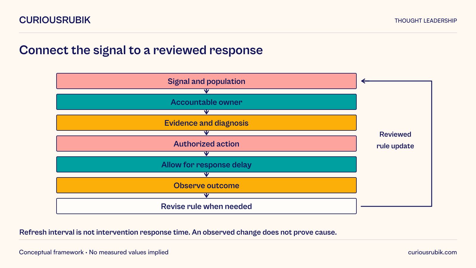
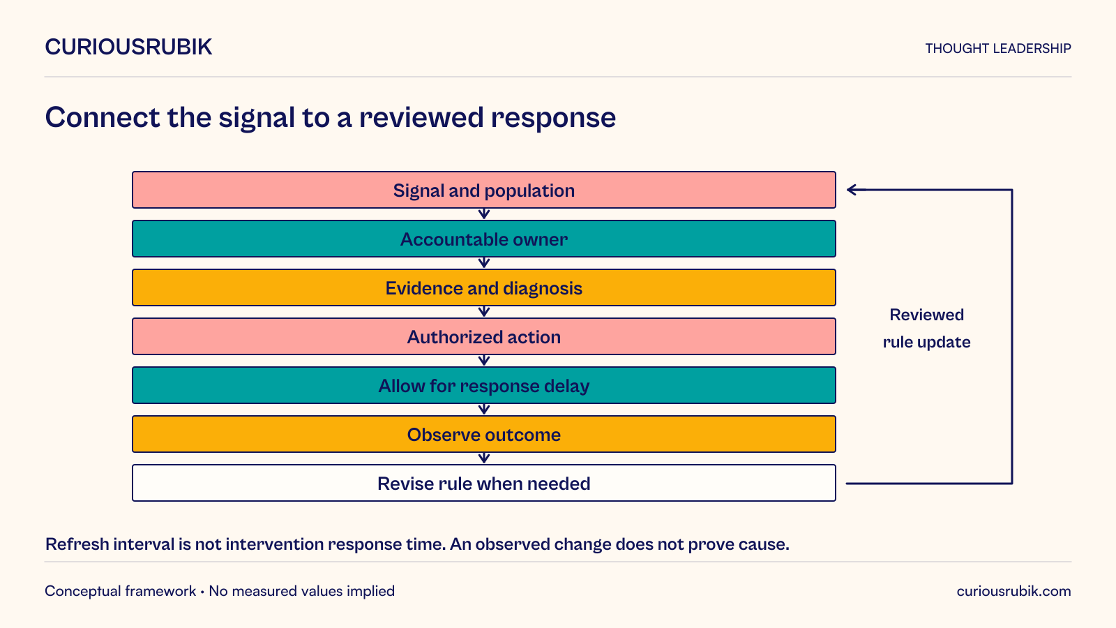
A response contract is a working design aid connecting a signal to an accountable process. Record the condition, affected population, owner, evidence to inspect, permitted actions, escalation route, and evidence of recovery. It is not a validated universal framework.
Specify whether the signal should interrupt someone, enter a work queue, or be reviewed periodically. Immediate interruption is appropriate only when timely attention is useful and the consequence justifies it. A condition that cannot be acted on until the next working day may need a different notification route.
Give the responder enough context to avoid searching from scratch. The alert or dashboard should identify the relevant items, source cutoff, known data limitations, and recent actions already taken. Several teams receiving the same signal should know who coordinates the response.
Keep authority explicit. A supervisor may reassign work within an approved team but lack authority to change a contract or grant additional access. The response design should identify the correct approval path rather than relying on urgency to expand permissions.
Match observation speed to action speed
A dashboard can refresh much faster than the system responds to an intervention. If a staffing change takes fifteen minutes to affect throughput, judging it after one minute can encourage repeated adjustments before any has had time to work.
Record the expected response delay and a review point for the intervention. During that interval, continue monitoring for conditions that require immediate escalation, but do not assume every short fluctuation proves failure or success.
Consider separate entry and exit conditions for reversible interventions where appropriate. For example, a local policy might require stronger evidence to start an escalation and a different, sustained condition to end it. The exact thresholds and durations must follow the process’s risk and behavior; there is no general number suitable for every queue.
Smoothing can reduce distracting variation, but it can also hide a sudden consequential change. A rolling average should not replace an immediate signal where a single severe event requires action. Use the combination of measures needed for the consequence, and make their windows visible.
Show whether the evidence is usable now
Freshness is only one part of usability. The dashboard also needs population coverage, definition stability, and a way to identify failed or delayed sources. A recently refreshed screen can display an incomplete queue if one intake channel stopped supplying records.
Show the business-effective time of the relevant data and the status of expected sources. Distinguish zero events from missing data. An empty queue caused by a broken feed should not be celebrated as operational recovery.
Preserve the metric version when a definition changes. If “overdue” begins using a different calendar or excludes a new category, the live trend may jump without any real change in service. Annotate such changes and avoid comparing incompatible periods as if they were one continuous measure.
Provide the evidence behind consequential aggregates. An operator should be able to inspect the affected cases and understand their classification, subject to appropriate access. Drill-down is useful when it supports diagnosis; unlimited access to unrelated data is not a prerequisite for a helpful dashboard.
Measure the response rather than the screen activity
Dashboard usage can indicate interest, but frequent visits do not prove better decisions. Track whether signals are acknowledged by the right owner, whether an appropriate action follows, and whether the intended outcome is reviewed.
Record interventions with enough context to learn: the condition observed, action chosen, expected mechanism, relevant assumptions, and time of implementation. This helps distinguish an improvement caused by the action from a change in arrivals or another external influence.
Avoid claiming causation from a simple before-and-after chart when several things changed. Where the decision warrants it, use a suitable comparison, staged rollout, or other evaluation design with qualified analytical input. In other cases, a carefully documented operational explanation may be the strongest practical evidence available, and its limits should be stated.
Review unhelpful signals. An alert that repeatedly produces no useful investigation may have the wrong threshold, population, or destination. Removing it can improve attention, provided the underlying risk remains covered. More alerts are not automatically more control.
Design the meeting and handoff around the information
A live view can support shift handover by showing unresolved conditions, owners, actions underway, and the next review point. Without that context, the next supervisor may restart an investigation or reverse an intervention whose effect has not yet appeared.
A periodic operations meeting should examine repeated causes and the effectiveness of the response rules. If the team continually reallocates capacity to compensate for the same source problem, the longer-term remedy may be process redesign rather than a more elaborate display.
Separate these rhythms. The live dashboard directs today’s attention. The review process changes tomorrow’s policy, data capture, or operating model. Connecting them avoids a situation in which people react quickly forever without addressing why the same condition returns.
There are limits to dashboard-led management. Some important consequences are difficult to quantify, some data arrives too late for intervention, and some decisions need direct conversation or professional judgment. The display should support those methods rather than imply that only visible metrics matter.
Test the whole response before expanding the dashboard
Run a tabletop or controlled exercise around a representative signal. Ask the responder to identify the affected population, verify the evidence, choose an authorized action, and state how recovery will be assessed. Include a missing feed, a definition change, and a condition already being handled by another team.
Observe where the process stalls. The blocker may be an unclear owner, inaccessible evidence, an impractical approval route, or a response that has no meaningful effect. Those findings are more useful than another round of color and layout changes.
Start with one prominent live metric and write its response contract. If no one can explain what decision it supports, reduce its prominence until the purpose is clear. A real-time dashboard becomes valuable when it helps the organization act with better evidence and learn from the result, not simply see the same uncertainty sooner.